The Whitney’s Warhol exhibit gave me a new perspective on his work. Up until “Andy Warhol— From A to B and Back Again,” I had only considered his art in two-dimensions – in books, in magazines, and on stark white walls. The current Whitney exhibit got me to consider him in three.
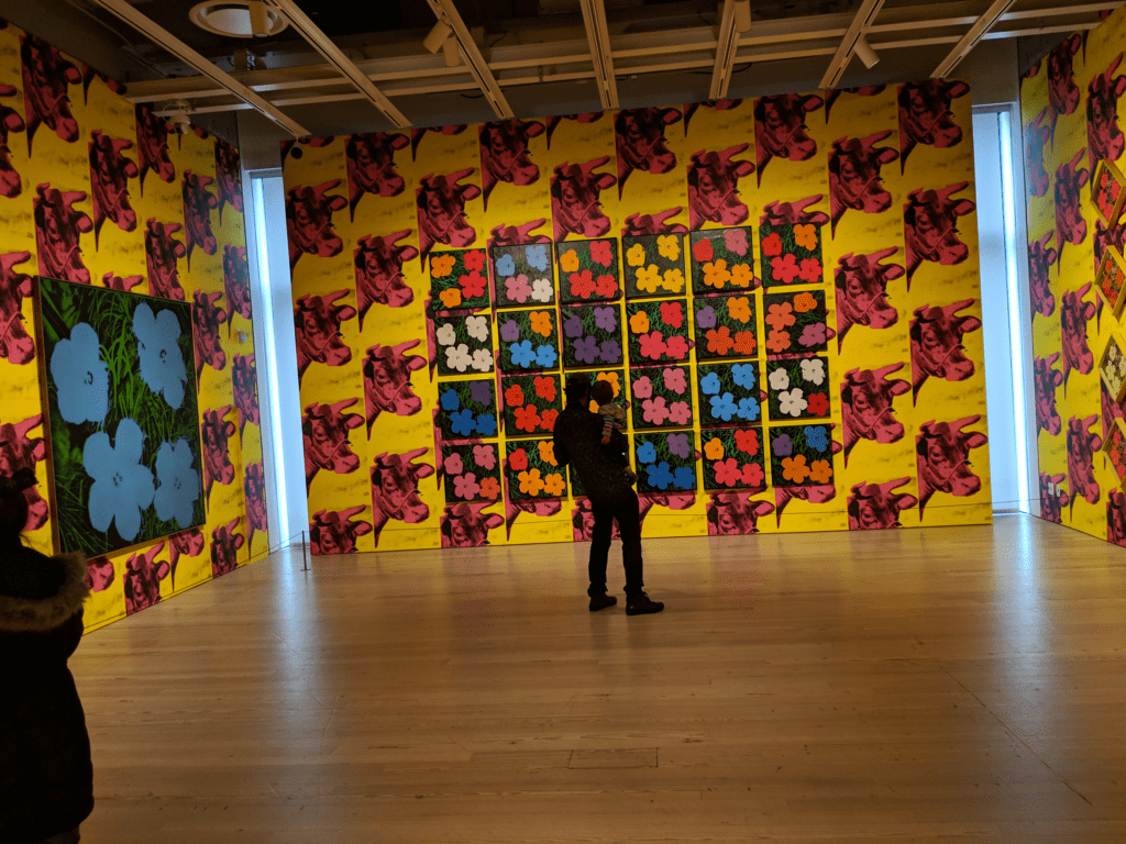
Two labels in particular helped me see this. One, around the corner from the entrance to the fifth floor exhibit, described the hanging of Warhol’s flower paintings. It said the paintings were hung the same way Warhol had hung them in his first Whitney retrospective in 1971. The room is wallpapered with pink- and yellow- hued Cow Wallpaper. His Flower paintings sit on top. Simple and pretty penta-petaled, colored dabs, his flowers have a whole new impact hung on yellow- and pink- hued cow portraits – especially in how the exhibit curators chose to light the room with its bare-tan-waxed wooden floors. (If you’re interested, the New York Times has their original 1971 review of the installation online: https://nyti.ms/2VkU9Xj)
The second label accompanies his famous Campbell’s Soup Can paintings. There’s a little black & white photo above the label’s text on depicting how it was first installed. The can paintings were set side-by-side on short ledges that seemed to span the gallery. Warhol wanted his viewers to feel like they were strolling through a supermarket aisle. After the spectacle of the “Cow Room,” I was disappointed that the Whitney decided not to display Warhol’s soup cans as he initially intended. It’s a missed opportunity to provide a new perspective on familiar pictures. Just as the Cow wallpaper changed the viewing of his Flowers, walking through a gallery of neatly lined shelves of soup cans would have been an experience of the paintings that hasn’t happened since their debut in Los Angeles decades ago. The Whitney stacked the soup cans as they had been in numerous magazine photos and on walls of other museums.
Adding to the disappointment of Cans is the “portrait gallery” on the first floor where you are immersed in Warhol’s celebrity portraits. It’s a warm room with a couch in the middle. You can sit comfortably and exchange glances with the many celebrities Warhol painted. It reminded me of the Cow Room because it didn’t have white walls (though I cannot remember what color the walls were as I write this). Like the Cow Room it didn’t feel like the typical white-walled gallery. Unlike the Cow Room the inclusion of a couch in the portrait gallery made it feel warmer and more inviting – more so because it was a couch instead of a bench or separate chairs.
If the decision to stack them were the result of limited wall space, a virtual experience might have successfully conveyed the feeling of wandering through supermarket aisles. Imagine putting on a VR headset and virtually “browsing” an aisle lined with Warhol’s soup cans like in the label photo or an entire “Warhol supermarket!” His Campbell’s Soup Cans would line the shelves in one “aisle,” while his Brillo Soap Pad Boxes would be “available” in the next aisle over. The “Warhol Market” would also “sell” Green Coca Cola Bottles, Close Cover Before Striking Pepsi-Cola, the Velvet Underground’s banana, and other Warhol depictions of fruit, sodas, and sundries.
The Whitney had a “movie theater” (a darkened room with a screen and chairs) where you could watch Warhol’s screen tests and on the third floor there was a short row of TVs with headphones so you could watch his old Manhattan cable TV show. But I wish they had copies (physical or electronic) of the early issues of Interview magazine that visitors could page through. Online they have an informative and well-organized site dedicated to the show with video and an audio guide to the exhibit: https://www.whitney.org/Exhibitions/AndyWarhol. I’m hoping they keep the site available after the show at the end of the month. It is a nice resource to have for people interested in Andy Warhol’s impact on 21st century art and his eager adoption of new technologies to pursue and promote it.

